
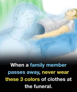
Funeral etiquette can be a bit of a minefield, but the general rule is to prioritize respect and solemnity over making a personal fashion statement. While modern services are becoming more relaxed, certain colors still carry connotations that can inadvertently offend the grieving family or draw the wrong kind of attention.
Here are three colors you should generally avoid wearing to a funeral.
1. Bright Red
In many Western cultures, red is the color of passion, energy, and celebration. Wearing it to a funeral can feel jarringly out of place and may be interpreted as a sign of disrespect or even "celebrating" the person’s passing.
• The Conflict: It is a high-visibility color that pulls focus away from the ceremony and toward the wearer.
• The Exception: Some cultures (such as in parts of China) view red as a color of luck or celebration of a long life, or the deceased may have specifically requested a "Celebration of Life" where guests are encouraged to wear vibrant colors.
2. Neon and "Electric" Hues
Colors like neon green, hot pink, or electric blue are designed to grab attention. At a funeral, the goal is typically to blend in and show support, not to stand out.
• The Conflict: These shades are synonymous with parties, nightlife, and casual summer activities. They can make the wearer look like they didn’t take the event seriously or were "stopping by" on the way to somewhere else.
• The Fix: If you want to wear color, opt for the "muted" or "jewel" version. Instead of neon green, try forest green; instead of hot pink, try deep plum.
3. Sparkling Gold or "Flashy" Metallics
While metallics aren't "colors" in the traditional sense, wearing a head-to-toe gold or silver outfit—especially those with sequins or high-shine finishes—is generally considered inappropriate for a somber occasion.
• The Conflict: High-shine fabrics are traditionally associated with evening wear, galas, and celebrations. They reflect light and can be distracting in a chapel or graveside setting.
• The Fix: It is perfectly fine to wear gold or silver jewelry, but keep the clothing fabrics matte.
Quick Guide: What to Wear Instead
If you aren't sure about the specific "vibe" of the service, sticking to these classics is a safe bet:
Preference
Traditional
Recommended Colors
Black, Charcoal Gray, Navy Blue
Softer Approach
Deep Olive, Burgundy,
Chocolate Brown
Neutral
Beige, Taupe, Sand (best paired with darker accents)
A Final Tip: Always check the obituary or the funeral home’s website. If the family has requested a "bright colors only" dress code to honor the deceased’s personality, then by all means—ignore the rules above and wear your brightest red!


.jpg)


0 Comments:
Enregistrer un commentaire